€€

i

10 - 25 thousand EURO

Booklet

Lock Antriebstechnik GmbH

Our client Lock Ertingen is currently transforming from a pure product manufacturer into a competence platform. Following the development of a forward-looking brand core to accompany this process, it is of great importance to Managing Director Frank Lock to first communicate this company milestone to the employees. From our perspective, a very special booklet, tracing Lock’s journey, is the perfect medium for this.

The Implementation

Planning & Conception
Text
Design
Implementation
Production

The objective is to take the employees along on a journey into the future with the help of the booklet.

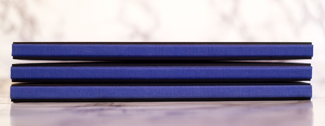
Packaged in a deliberately high-quality hardcover in a special square format, the booklet guides the reader through the world of Lock and emphasizes the very special Lock spirit. From Lock’s perspective, this is a key success factor for the company.

Graphically reduced and modern in style, the booklet captivates the viewer with its emotional visual worlds, realized on the basis of a photo briefing. It communicates the Lock code of values, the future strategy as well as the brand core in a purist form – and yet in a way that speaks volumes. In this manner, it succeeds in inspiring and motivating the employees in a very personal, appealing way and ultimately in taking them along on the shared journey into a promising future.

PS: The sweeping brushstroke on the cover visualizes the section where the Danube flows past near Ertingen – as a symbol of Lock.

„KAOS has been „our“ agency for many years – and not just a „classic“ advertising agency. In 2017, Lock’s vision, mission, and medium-term strategy were redeveloped. Based on this, Lock’s brand core was elaborated in 2018/2019 as part of a brand development process with KAOS – supplemented in 2020/2021 by the Lock employer brand.

To summarize the entire strategic work, the booklet ‚We are Lock‘ was developed together with KAOS on the occasion of Lock’s 175th anniversary as a condensation of our self-understanding. All these ideas led us to the symbol, the key visual ‚Danube‘. Drawn freehand – breaking the frame – detached from the square – light blue Danube – Lock-blue e³ – where Ertingen lies in the loop of the Danube. Thanks to KAOS for the brilliant design!“

– Franz Lock
Managing Director

Do you have any questions?

Hubertus Edited Final
Hubertus von Kolkow

Head of Brand Consulting/Strategy

Start your project now!